Where Stories Begin
Edward Benguiat Typography Exhibition
Intermediate Typography / MassArt
Where Stories Begin is a speculative exhibition identity for the Museum of Arts and Design (MAD) focused on the life and work of typographer Ed Benguiat. Over the course of his career, Benguiat designed more than 600 typefaces that became part of everyday visual culture.
The visual identity takes inspiration from the worlds his typography became part of including science fiction, horror, television, and film from the 1970s and 80s. Bold type, dramatic compositions, and references to printed and projected media create an identity that feels connected to the era and the work itself. The exhibition explores how Benguiat’s type became connected to the stories, characters, and media we recognize. The title, Where Stories Begin, comes from this idea.
Mood Board
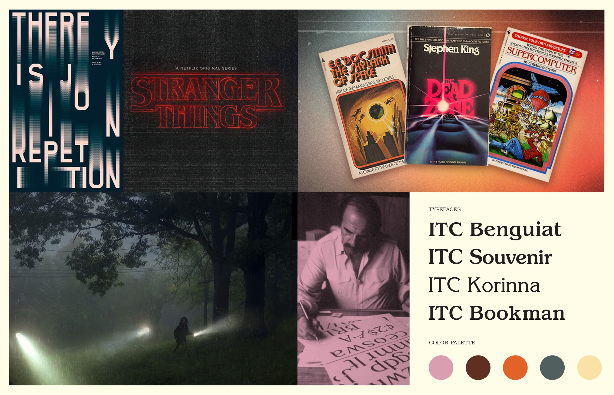
The research focused on the visual culture surrounding Benguiat’s work. Stranger Things, Stephen King paperbacks, Choose Your Own Adventure covers, and horror films all became references because they were places where his type actually appeared. Rather than directly recreating these influences, I wanted to capture the feeling of that era while keeping the identity appropriate for a contemporary museum.
The color palette developed from the same references. Warm ambers, burnt oranges, dusty pinks, and deep teals draw from the look of 1970s film photography and print design. Together, the colors give the identity a sense of nostalgia without making it feel overly retro.
Exhibition Poster
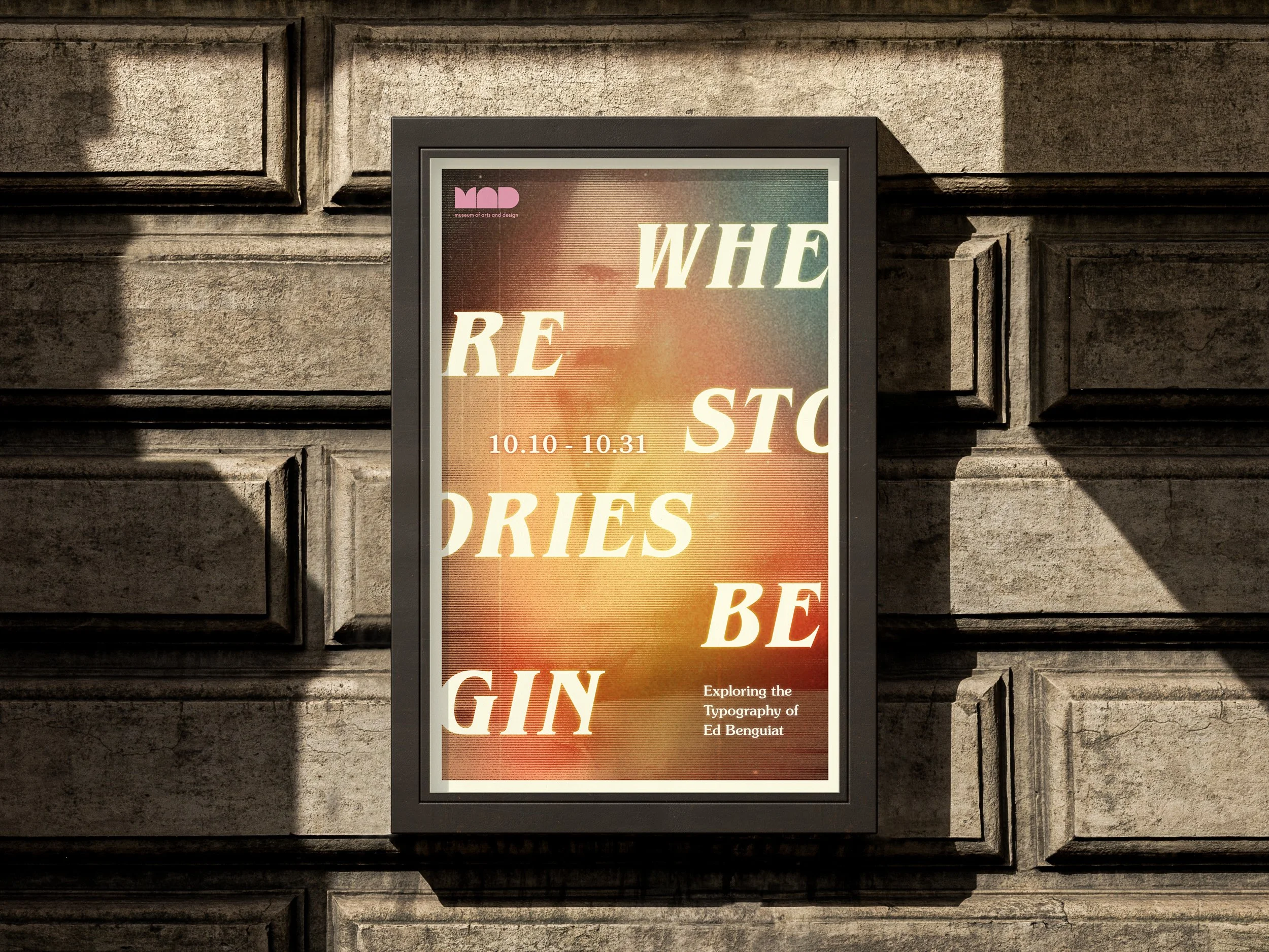
The poster is built around large, expressive typography. “WHERE STORIES BEGIN” extends beyond the edges of the composition, with letters and words overlapping and breaking apart across the surface. The composition draws from the visual language of science fiction and horror, creating a sense of movement and mystery.
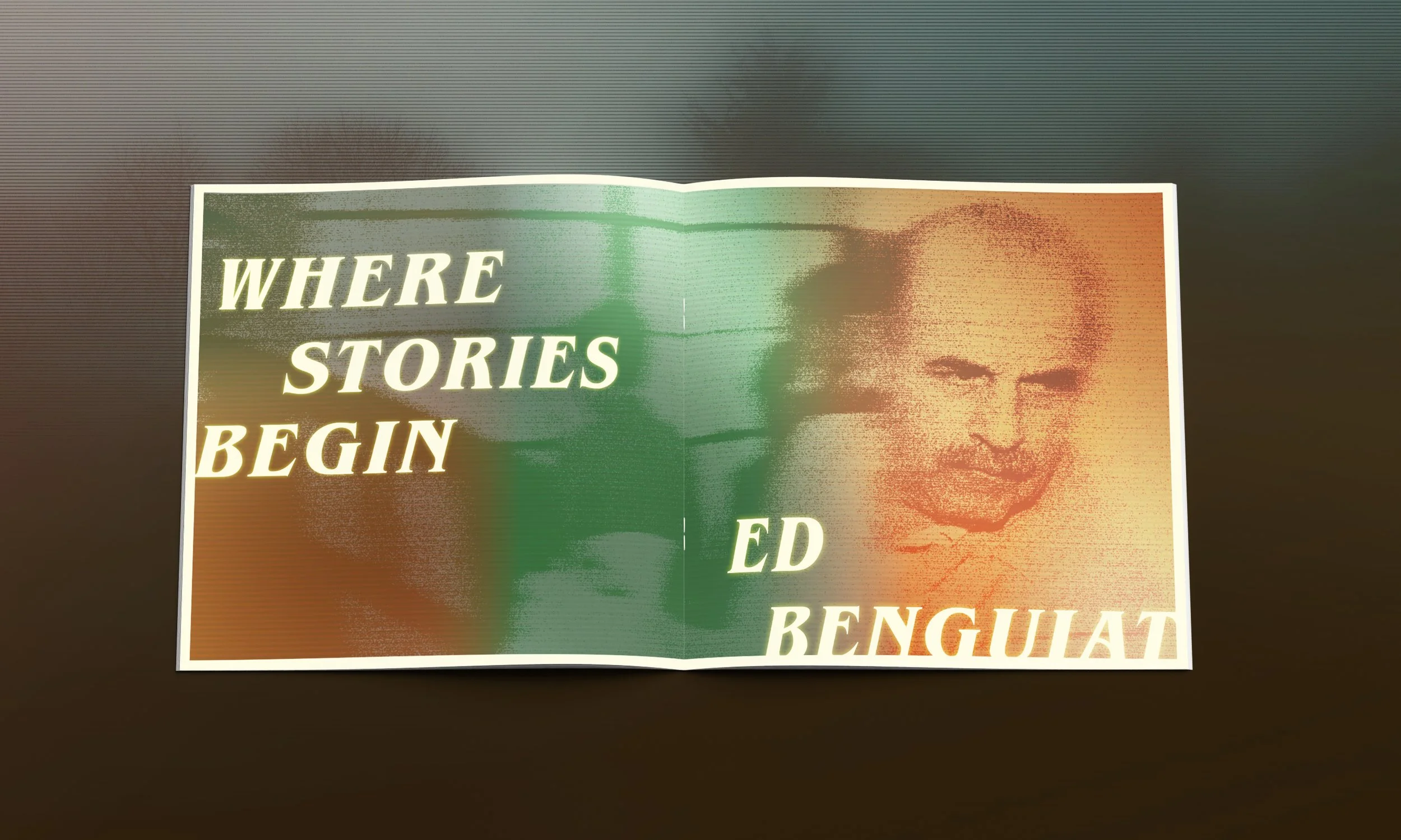
Benguiat’s portrait sits within the background, partially obscured by the type. I edited the image in Photoshop, using gradients, grain, and layered textures to create a sci-fi-inspired atmosphere and give the poster a slightly aged, cinematic quality. His presence is subtle, almost like a figure hidden behind the type, reflecting his role as the designer behind so many familiar stories.
Exhibition Wall
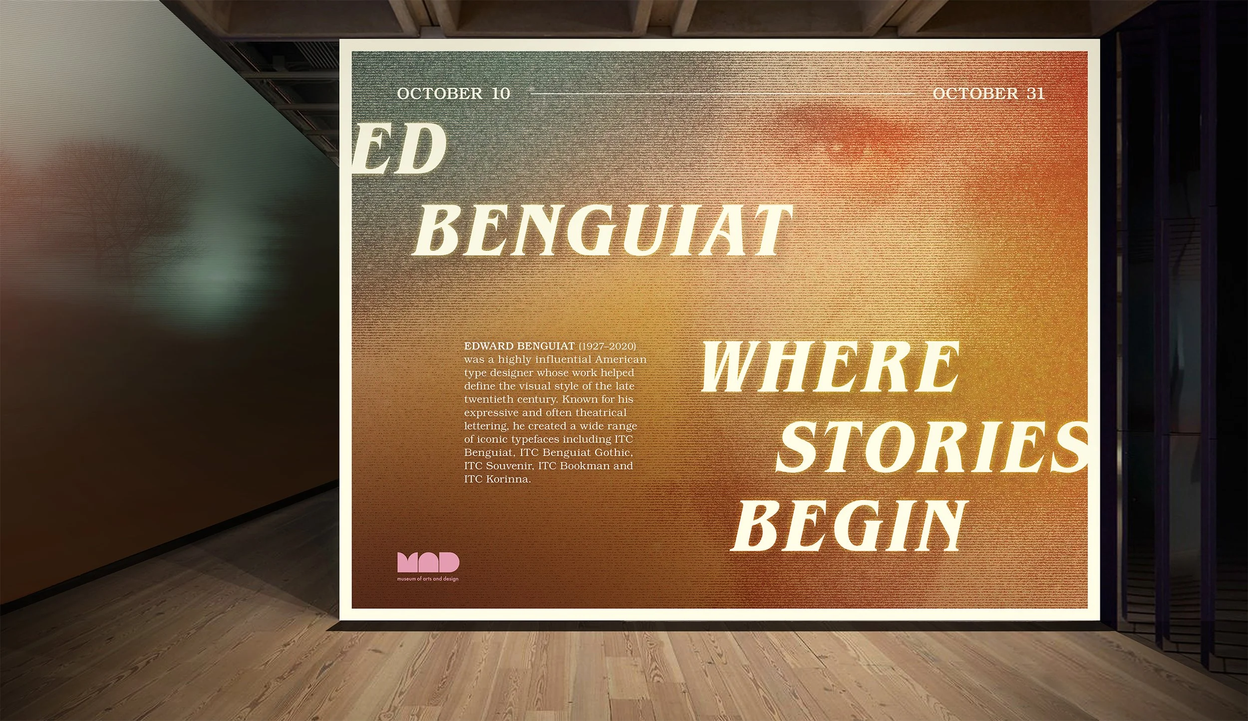
The exhibition wall takes a more structured approach than the poster. The full title is easy to read, with a clear typographic hierarchy that gives the information more space. A warm gradient fills the background, reinforcing the cinematic, sci-fi-inspired feel. A close-up of Benguiat’s penetrating eye greets visitors as they enter the exhibition, adding intrigue and drawing them into the space.
A short curatorial text introduces Benguiat and his work, giving visitors some context before entering the exhibition. The MAD logo acts as a simple institutional anchor without competing with the design. As the first piece visitors see, the wall sets the tone for the exhibition and gives them a glimpse of what they are about to experience.
Exhibition Catalog
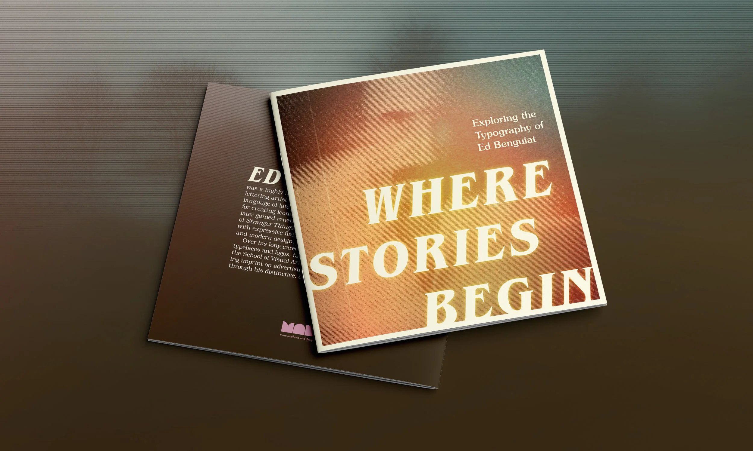
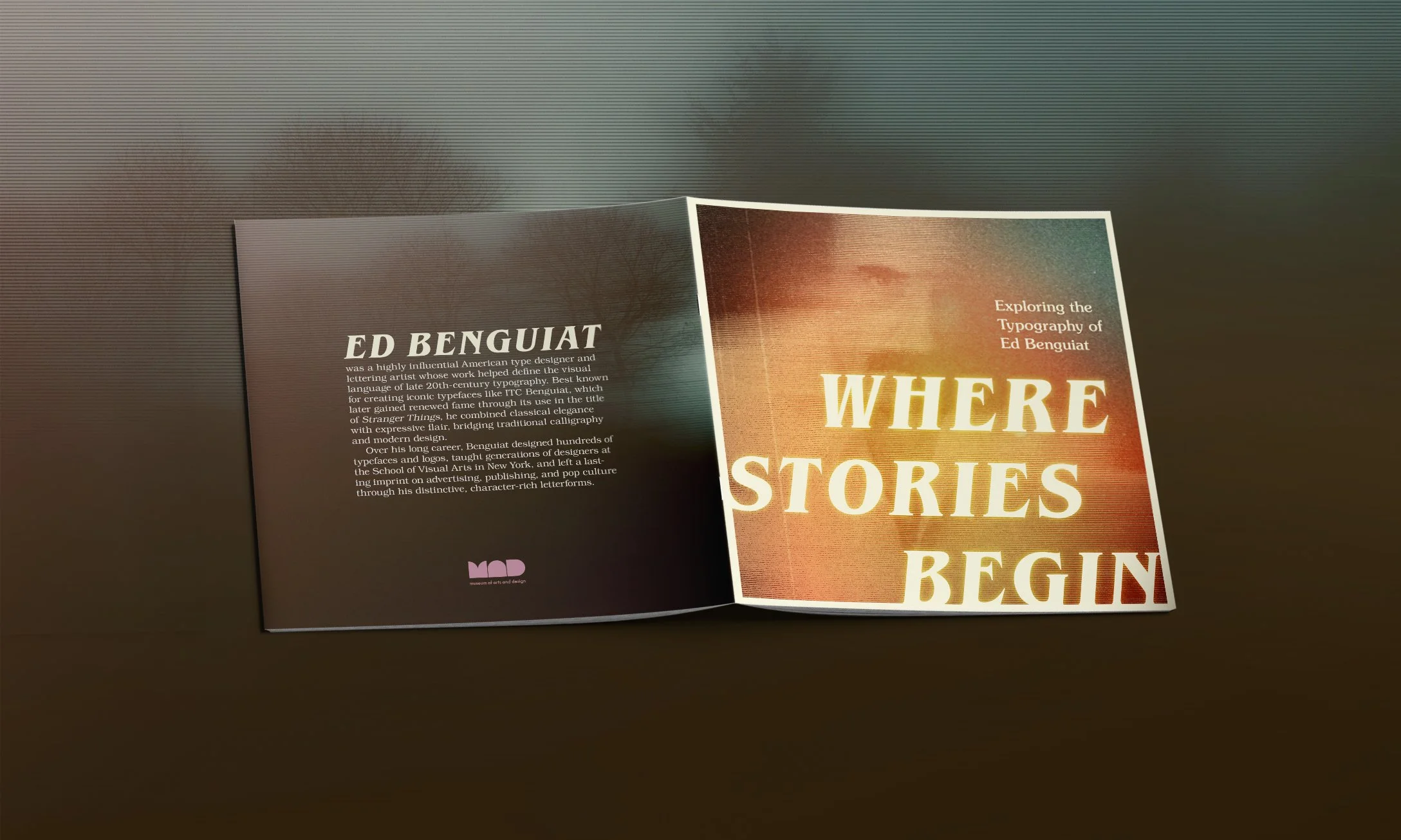
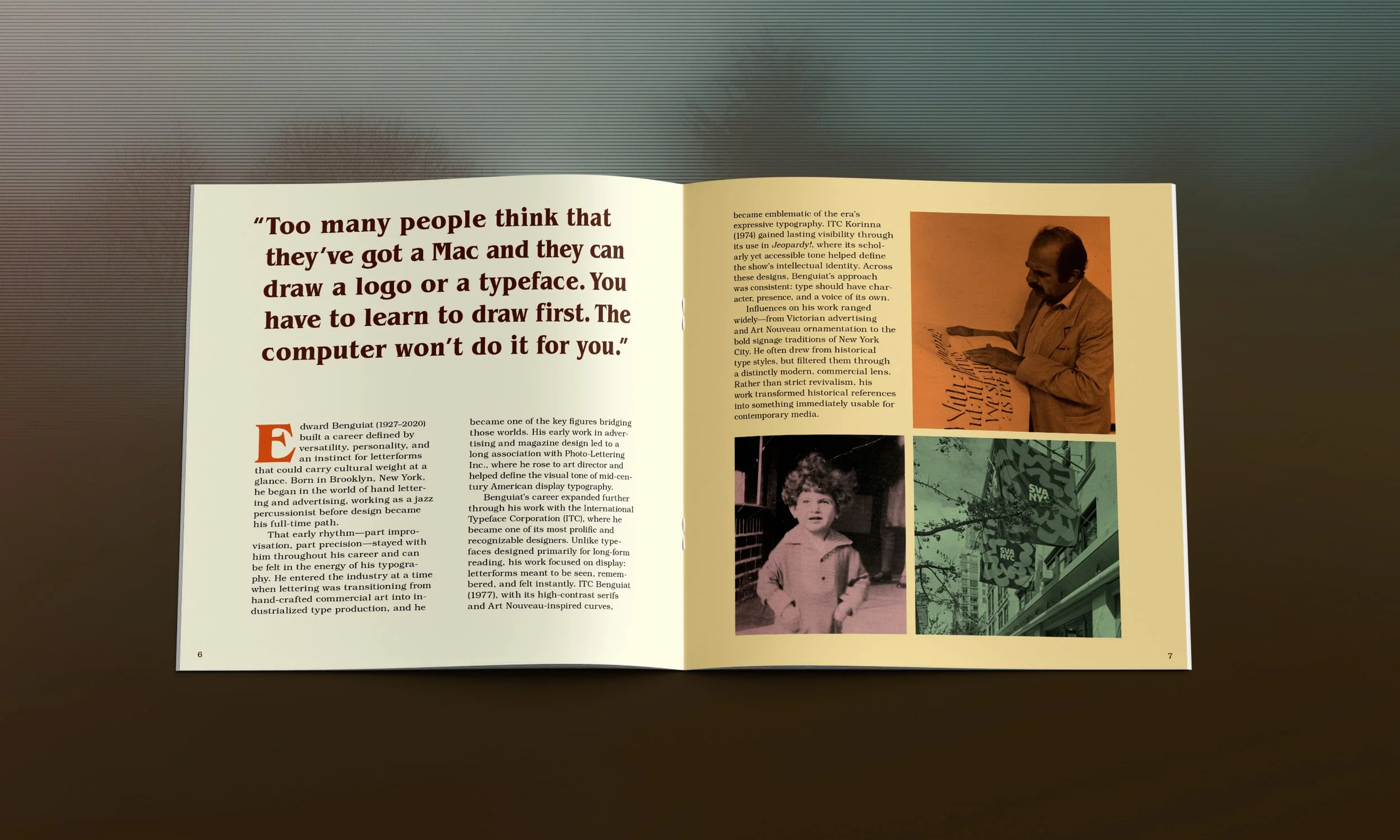
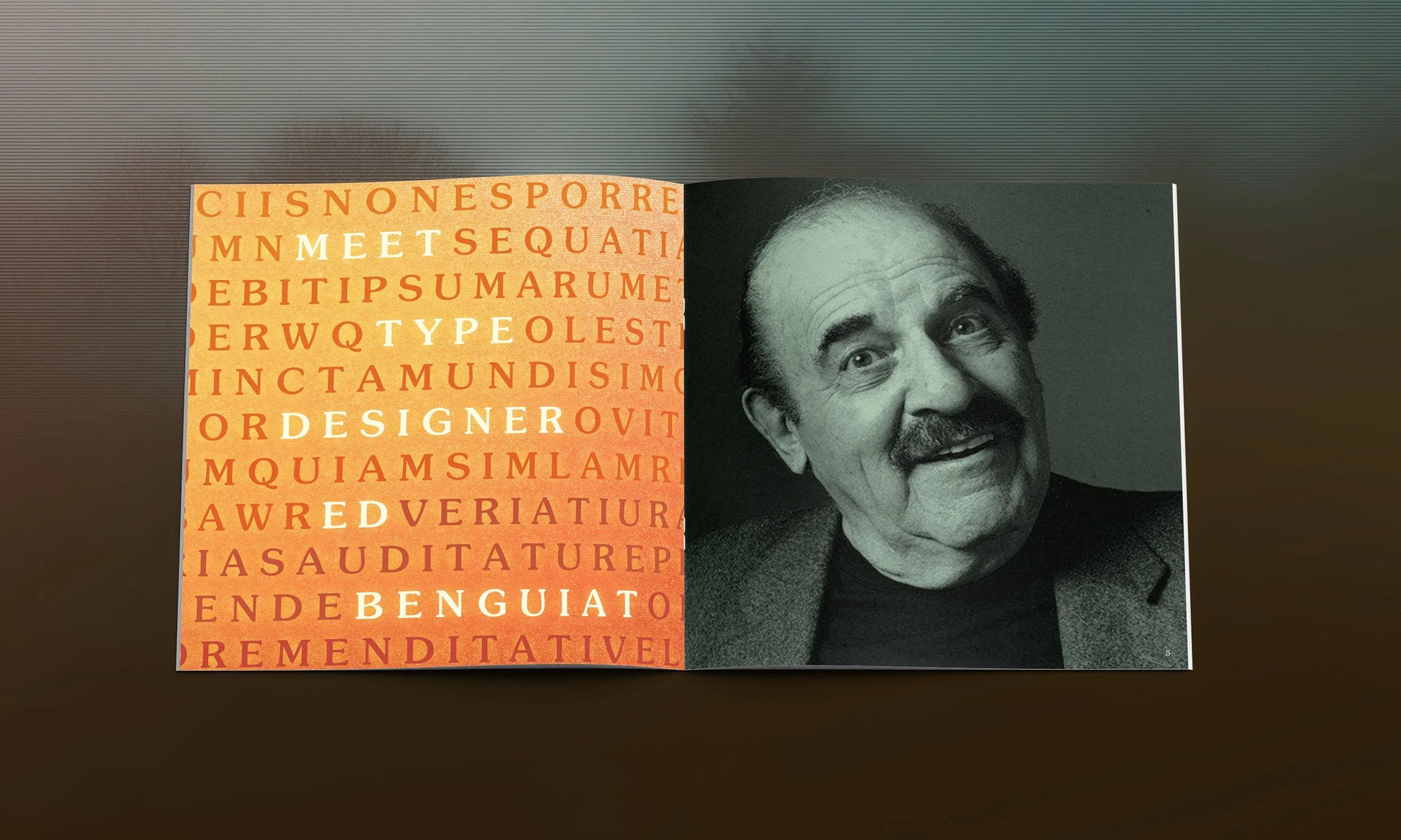
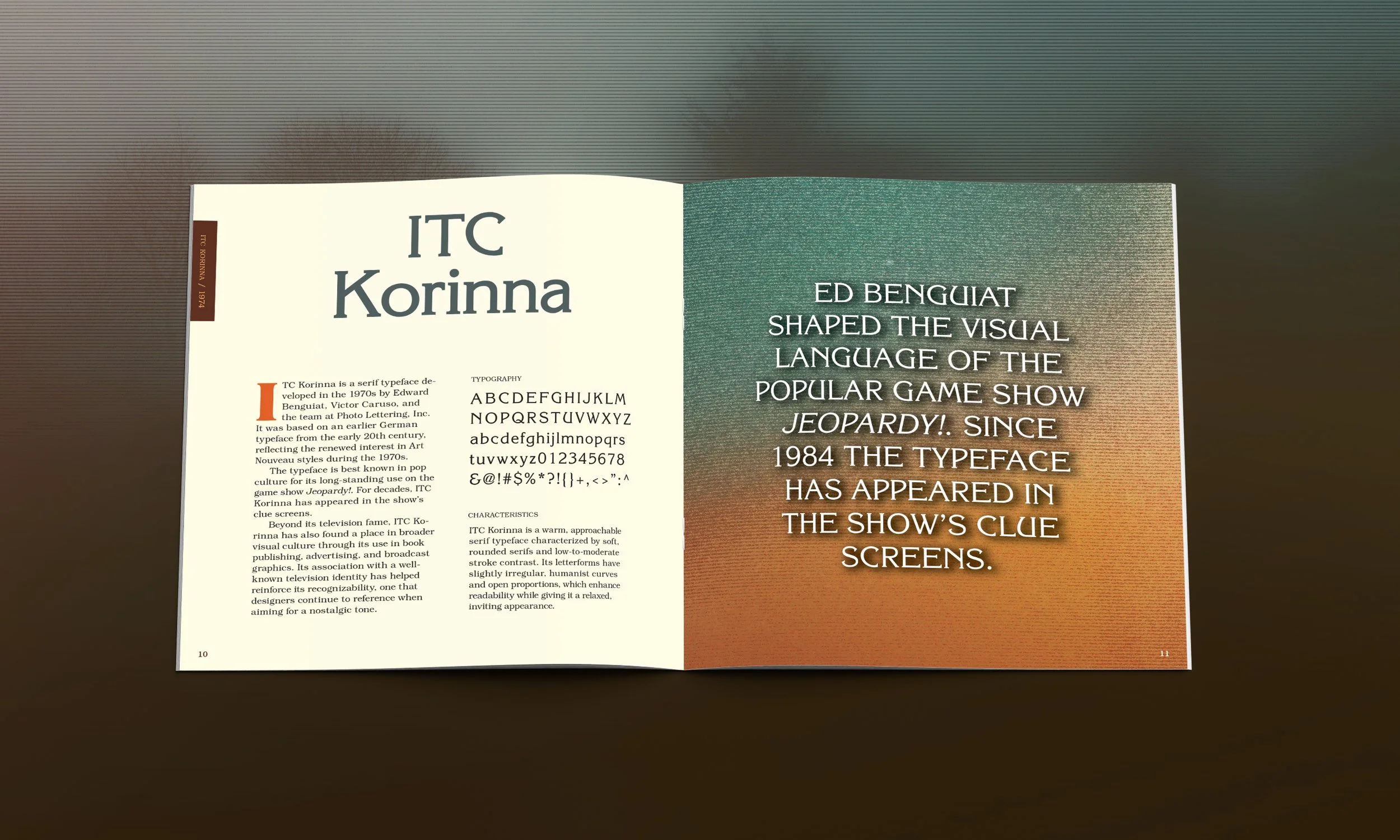
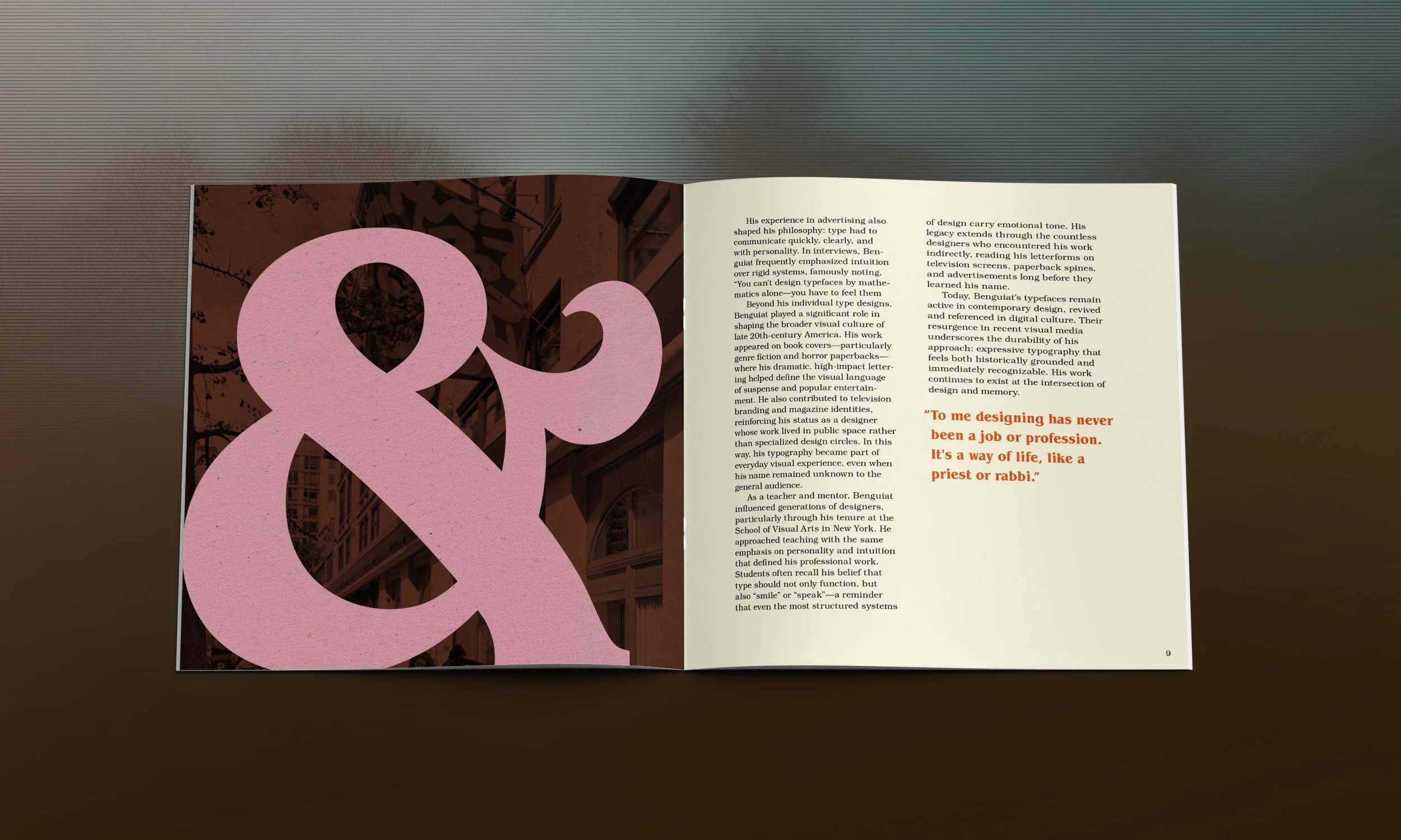
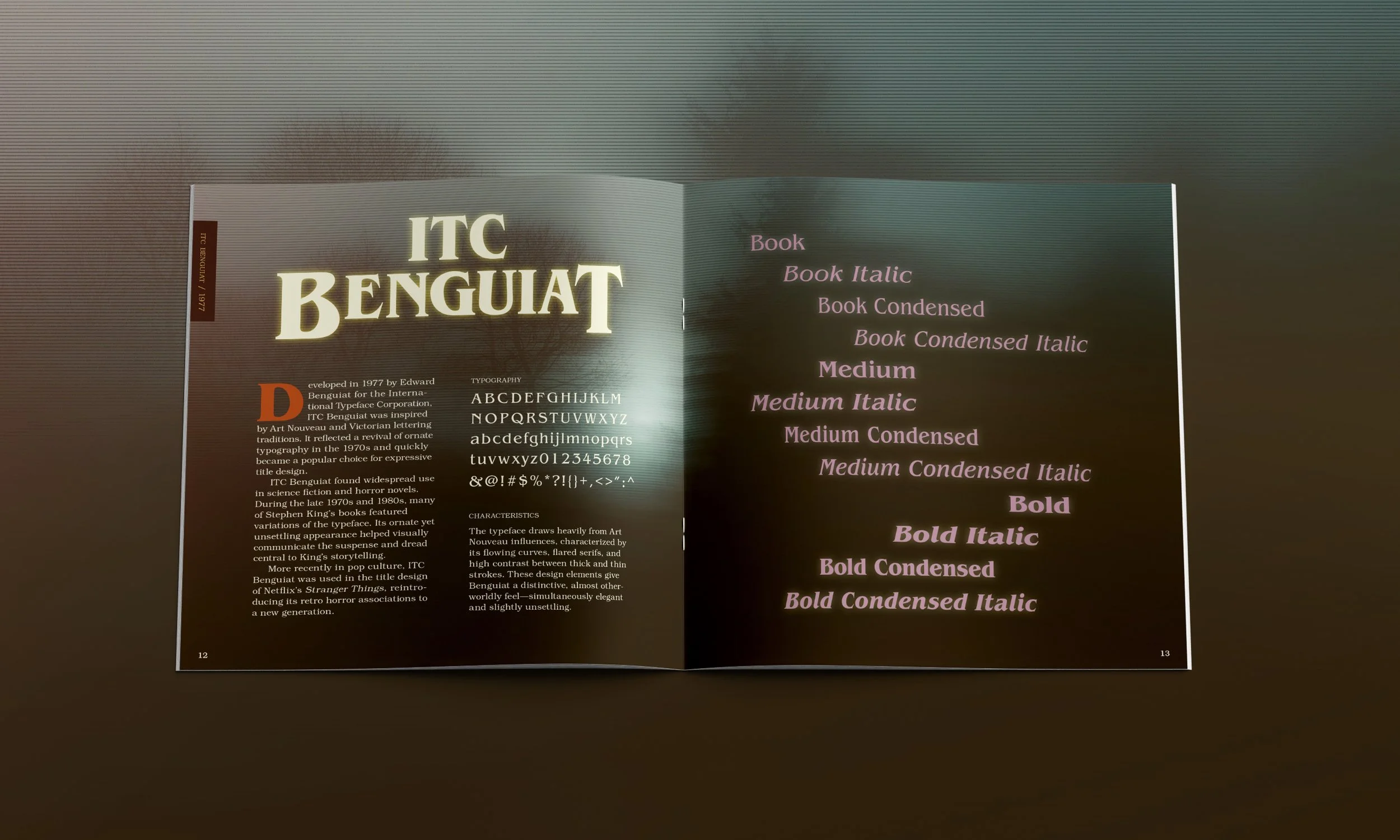
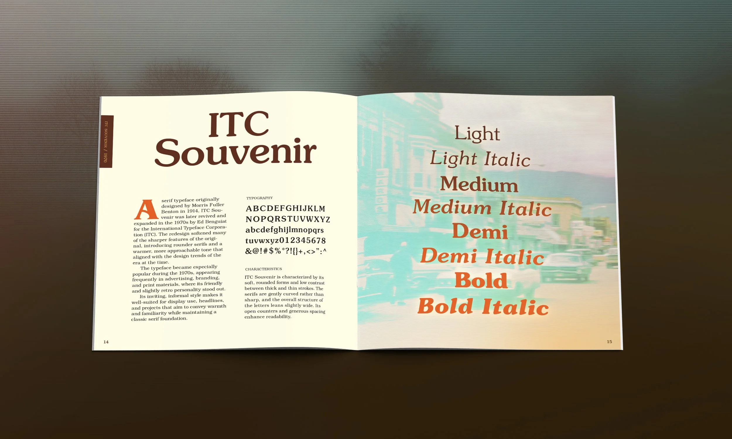
The catalog carries the exhibition identity into a more editorial format. It uses three of Benguiat’s typefaces, each with a specific role: ITC Benguiat for large headlines and display type, ITC Souvenir for subheadings, and ITC Bookman for body copy. Using Benguiat’s own typefaces throughout the catalog was an intentional choice. It gave me the opportunity to show how these typefaces could work in a more formal editorial setting, rather than only in the contexts they are commonly associated with, like horror novels and paperback covers.
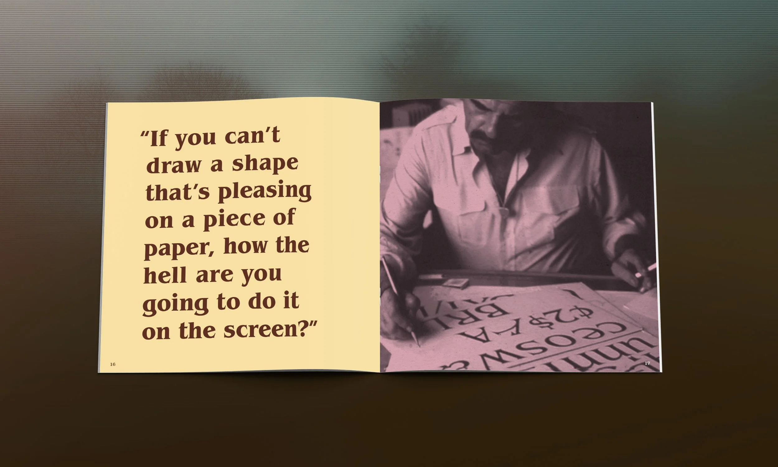
The photography uses a duotone treatment inspired by the printing techniques and visual style of 1970s publishing. The limited color palette gives the images a warm, tactile quality and makes them feel slightly aged, almost like something pulled from an archive.
Digital Ads
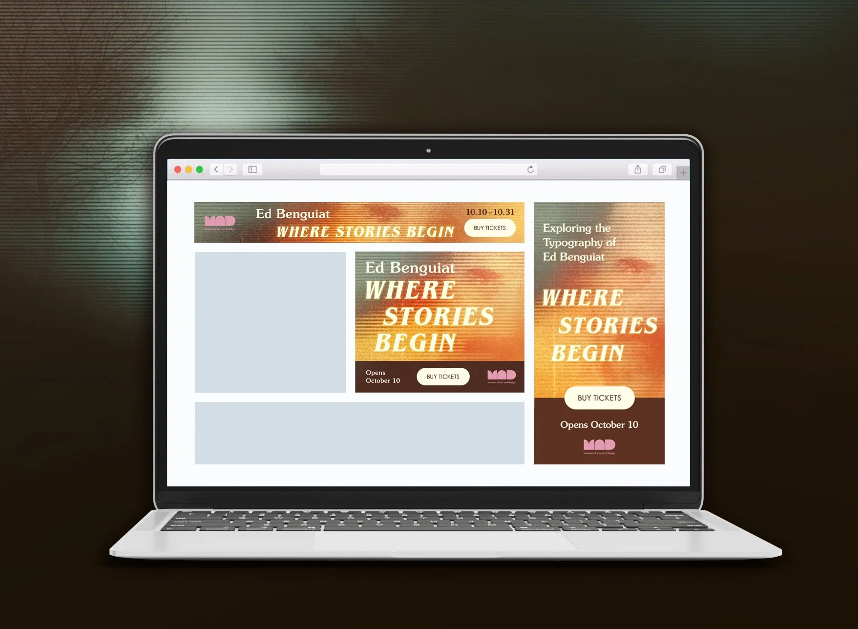
The digital campaign extends the exhibition identity into an online setting through three standard ad formats: a 728×90 leaderboard, 300×250 medium rectangle, and 300×600 half page. Each ad uses the same visual elements as the larger identity, including the gradient background, Benguiat’s typefaces, color palette, and “Buy Tickets” call to action.
I presented the ads in a browser mockup to show how they would work in an actual digital environment. The different sizes are placed in their typical positions on the page, giving the campaign a more realistic context. The goal was to show how the identity could adapt across different formats while still feeling consistent and recognizable.